Transform your SharePoint site's header with powerful branding and navigation customization options. The Sprocket Header provides a professional, branded experience that can be tailored to match your organization's visual identity.
Features
Custom Branding : Add your logo and customize colors to match your brandFlexible Layouts : Choose from Standard, Compact, or Custom header heightsAdvanced Navigation : Support for Hub, Site, and Term Store navigation with Cascading or Mega Menu stylesResponsive Design : Minimize header on scroll for better user experienceSocial Features : Display site followers and share counts
Quick Start Overview
VIDEO
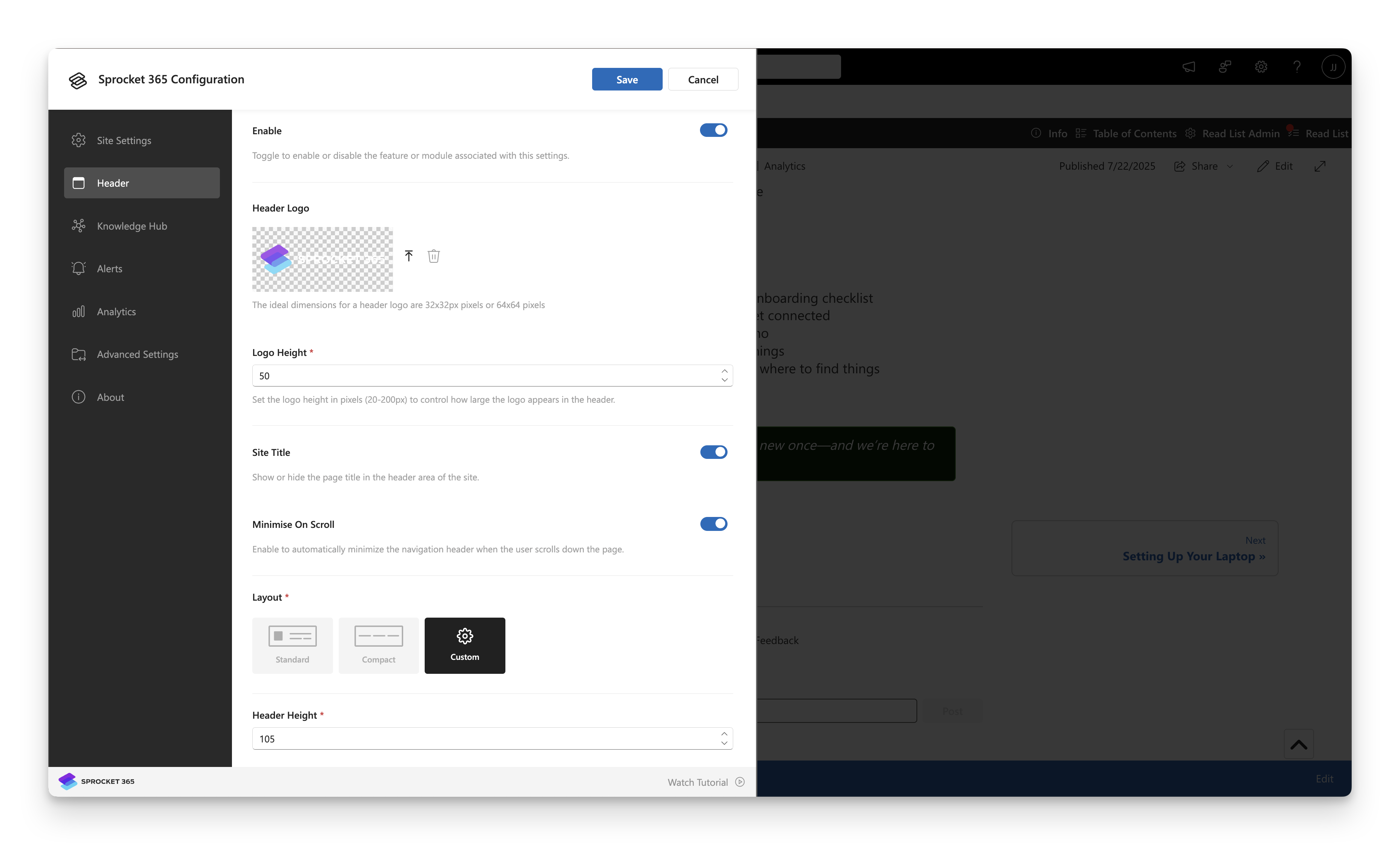
Configuration Options
Setting Description Enable Enable the Sprocket header on your site. When enabled, additional customization options become available. Header Logo Upload a custom logo to display in the header. Click Select Logo to choose your image. Logo Height Adjust height of logo appears in Sprocket header. Site Title Display the site title in the header alongside logo.
Layout & Appearance
Setting Description Minimize On Scroll Switch between standard and compact header when scrolling for better content visibility. Layout Choose header size: Standard (default), Compact (reduced height), or Custom (set your own height). Header Height Set a specific pixel height when using Custom layout option.
Color Customization
Setting Description Font Color Customize header text color using the color picker. Reset to default option available. Icon Color Set the color for header icons and UI elements. Reset to default option available. Background Color Choose a background color for the header. Reset to default option available. Background Image Upload a background image for the header. Click Select Background Image to choose.
Navigation Settings
Setting Description Show Navigation Enable navigation in the header. Choose from Hub , Site , or Term Store sources. Navigation Data Source Select where navigation items are pulled from (Hub, Site navigation, or Term Store). Menu Style Choose between Cascading (traditional dropdown) or Mega Menu (multi-column layout).
Setting Description Menu Background Color Set the background color for Mega Menu dropdowns. Menu Font Color Customize the text color within Mega Menu items. Menu Hover Effect Color Define the color that appears when users hover over menu items. Menu Divider Color Set the color of lines that separate menu sections and items.
Social Features
Setting Description Show Following Display the number of users following this site in the header. Show Share Show the site share count to encourage social engagement.